Dear Insane Children,
We’re recently working on a new Plushie Dreadfuls design based on the notion of “OCD” – Obsessive Compulsive Disorder and “OCPD” – Obsessive-Compulsive Personality Disorder. This effort is being made due to frequent and vocal requests by fans to create such a product. It’s also an interesting project for me – American – because I too suffer from various symptoms related to OCD.
My concern about “stepping on cracks” continues to this day. When using Photoshop, I am weary to click on “stroke” (to create an outline around a font) for fear that, like stepping on a crack, it might cause me to have an actual stroke. I often need to repeat actions (tapping on things, etc) – and absolutely cannot work, sleep, or function properly when there’s a mess anywhere near me. It’s nowhere near as bad as it used to be – when I was a kid if I looked at something (say a dog) once, then I had to look away and then look at it again 3 more times (to equal 4 or another even number). As you might imagine this wasted a lot of time and caused a ton of frustration and tension.
Anyway… I don’t want to go on about my personal connection to this issue… but I feel some amount of explanation is necessary due to the surprising amount of negative feedback this plush design generated. It wasn’t “heaps” but it was noticeable. With the most common complaint being that “stereotyping OCD and cleaning is **ACTUALLY HARMFUL**” – whereupon OP literally died and we never heard from them again.
So in an effort to reduce the number of deaths caused by my online posts, I’m including a bit more explanation about what’s going on with this design and the thinking behind it.
The issue of focusing on “cleaning” has nothing to do with stereotypes. It has everything to do with implementing symptoms of OCD within the constraints of a plush toy. There’s only so much we can do with fabric, stuffing, and embroidery. With my own issue of counting, even numbers, and looking at or tapping things – how exactly do you represent that in a plush toy? I have no idea. And our ACTUALLY HARMFUL commentators died before they could share any design ideas to address this question. RIP, OP.

Still, we’ve collected what ideas there were and put them into the revised design images you see above.
The first (main image above) is from Jen and it incorporates several ideas we pulled from online comments plus a few of our own. First, it’s got “crinkly material” inside a removable brain to represent uncontrollable thoughts and a brain gone haywire. The removable squishable brain might also provide some degree of tactile stress relief?
Jen also added lines around the eyes to indicate lack of sleep from obsessive thoughts or repetitive behaviors. There’s also red stitching around the face, hands, and legs to represent damage from cleaning and/or skin picking.
We’re also thinking we might include a little mask (double duty for Covid protection and general germaphobia?). Seems double-appropriate given everything going on in the world these days.
And Alex sent over a design sketch that tries to capture the idea of “control and order.” Of this he says:
You could trim little velcro adhesive shapes, that could be stuck all over him randomly before transit.
Once you get him, Reposition the pieces to make a perfect geometric shape, (heart) or remove them. You allow the owner to have a level of control and expression through their rabbit. Which might be nice in this case.
That seems like an interesting idea. Depending on the type of fur we use it might not function as desired. But we can give it a test.
Crowd Design Time!
Do YOU have any other ideas for ways we can represent lesser-known symptoms of OCD or OCPD inside the constraints of a plush toy?
Let us know in the comments below. We’ll do one more round of design sketches before sending this off to the workshop.
Meanwhile Over in Wonderland
Still lots of amazing art flowing from the Asylum team.
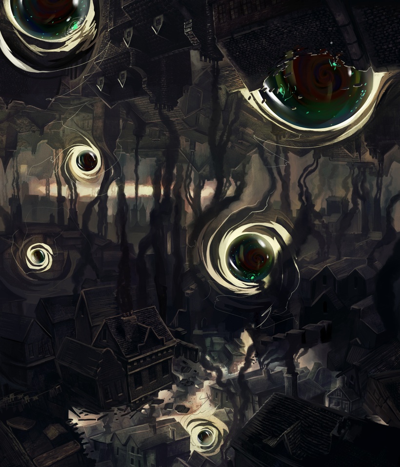
Of this image (London in Umbraland) Omri says:
i wanted to make London so dark that the darkening portals will look even more like they are sucking the light out of everything. the world not only dark but even dimming. FYI the portals are not lighter or darker then the rest of the pictures it’s just that the image is so “burnt” that they look so glowing.
To which I said something like, “It’s images like these that make me want to MAKE THIS GAME ASAP!” Wow. Love it.
More art and updates on the way later this week.
From Shanghai with 1, 2, 3, 4,
-American