Behold it in all its glory:
The process for choosing a logo can be weird and painful. There’s conflicting opinions on the value of a product’s logo and packaging in general. Would “World of Warcraft” be any less successful if it shipped in a brown paper bag with “WoW” scribbled in crayon on the outside? Would Apple’s brand perception be what it is if its logo was anything more than simple Macintosh with a bite taken out of it? And who decides what’s best – art director, test audience, marketing guy?
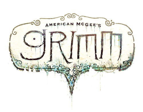
While trying to decide what to do for the “Grimm” logo we had two prevailing (and conflicting) thoughts on direction. Option 1: Simplicity, ala a non-illustrated movie “logo” (basically a simple font treatment). OR Option 2: illustrated logo that “said something” about the product. No amount of argument could make these two camps see eye to eye. So we decided to put it to a vote.
Fifty logos were put on display and votes were taken. Ironically, the sample audience avoided both the overly simple and overly illustrated logo samples. They went for the logo you see, something I feel is “in the middle”.
I’ve always been a firm believer in the idea that “a horse designed by committee is a mule.” So maybe our logo is a mule, but I like it. It’s simple and it says something about the product.
(“Grimm” logo designed by our art director, Ken Wong.)
I do agree with you, it is a pretty great logo, Ken Wong is doing very good job !
I’m especially fond of his drawing with a Red Riding Hood fighting a big shadowy wolf.
That’s a very nice looking mule! 😉 And it goes very well with the 3D artwork.
Of course I’m curious about the logos that didn’t make it. Care to share some?
Very Gahan Wilson, very dark, very good.
I like the logo. It has the fairy-tale-esque look to it, but all messed up and dirty. 🙂
I notice the outline of bottom part *could* resembles the top part of a love heart somewhat. If you curved it a bit more to make it more obvious, it could be like a reverse-outline of a heart… which I think would be kind of symbolic. Just a thought. 🙂
i agree, it’s stylish, the colors are not too much and it makes me feel like i just want “more” it’s a good logo and as usual Ken Wong kicks ass.
Very Whimsical…always necessary for a good fairy tale.